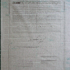
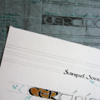
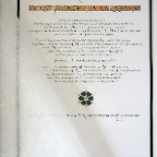
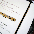
The couple wanted a simple, but effective design, keeping
graphics to a minimum. They wanted to emphasize the text
and keep with traditional wording according to Muslim
culture. The overall result was to be more of a formal,
legal document.
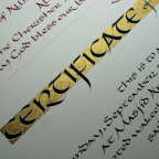
I particularly enjoyed working on this project, as it
allowed me to tap into certain aspects that are inherent in
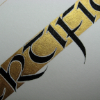
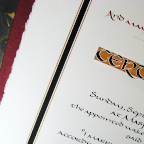
this culture: color and pattern. I chose bolder colors such
as crimson, deep emerald green, and velvet black, for both
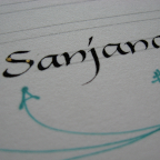
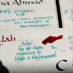
the folder and for the calligraphy. Crimson was essential
in bringing out those passages within the text that
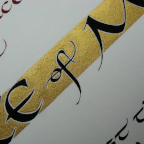
referred to 'Allah' and 'Muhammad.' Gold coloring was used
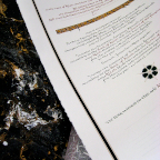
in the marbled folder endpapers, the 'Certificate of
Marriage' banner, and in the medallion pattern to bring a
sense of illumination and highlight to this overall
presentation.
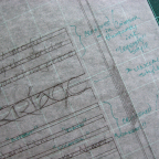
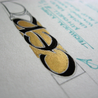
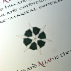
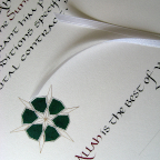
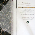
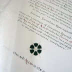
As you may notice, certain elements of the layout did
change from initial mock-ups to the final piece. Most
notable is the evolution from the gold swash flourish to
the final medallion pattern. The change resulted from
wanting to be more in tune with Islamic aspects rather than
just inserting a generic artistic flourish.
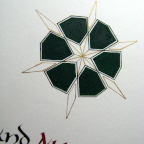
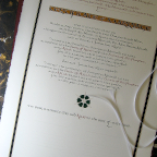
I wanted the medallion pattern to be unique, yet based on
the repeating, geometric designs that are found throughout
Arabic art, particularly its calligraphic decorative
borders and architecture. Keeping the graphic small (about
2" square) and more focal as a separator between the main
text and the witness signature lines was a requisite so as
not to overwhelm the document. It also accommodated
personalization of the certificate without drawing emphasis
away from the religious and legal overtones.
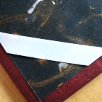
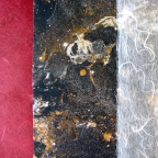
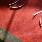
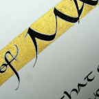
Rather than affixing actual ribbons running the entire
length of the document on both sides, it should be noted
that the black and gold "ribboning" you see is painted to
keep the document flat and streamlined, yet still maintain
a framing, formal layout.